Why Non-responsive Websites Are Hurting Your Law Firm
I’ve thought a lot about why responsive design is so crucial today. There are plenty of opinions out there. To really get at the answer, I think it would be helpful to first look at a definition of responsive design.
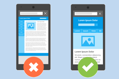
In a nutshell, responsive design is a framework for giving users the optimum experience for viewing your website no matter which device they are using.
What this means is that content--text, images, videos, etc.--adjust to optimally fit on any tablet or smartphone. It saves the mobile device user from the inconvenience of having to scroll horizontally, zoom in, and so on to get at the content they’re after which can be frustrating.
Folks, it’s not about the mobile devices. It’s about the user plain and simple. When so focused on optimizing legal websites for mobile devices, it’s easy to forget about the user. Having to work to get at content can be incredibly aggravating. But users will stay the course, right? Wrong. Mobile users will bounce from your non-responsive website to your competitor’s faster than a hot knife goes through butter. So the client that could have been yours, is now theirs.
But there’s more. Statistics show that approximately half of all mobile web users will never return to a website they’ve had trouble viewing in the past. Let me repeat that--they will never return to a website they’ve had trouble viewing in the past. The reason is simple. If you’re not willing to invest in making their web experience a good one, why should they invest their time in your law firm? You are essentially telling clients you don’t value their business.
So how do you ensure a good user experience?
First of all, having a responsive design doesn’t mean your legal website is optimized for mobile devices. You can implement a responsive design, but you need to test every single practice page, attorney profile photo, etc. to make certain it renders beautifully on any device or screen size. It’s the only way to ensure a good user experience. A beautiful page layout can still look bad on mobile devices. Every aspect of your chosen design should be tested for, and dictated by the user experience.
Another big challenge is speed. Mobile device users will leave your legal website after five seconds of not getting what they want. Slow loading times, which can be a problem for responsive websites, are caused by the practice of loading all content--text, images, carousels, and so on--at once. You need to understand what your user wants from a page, and load that content first. Use analytics to determine what users are viewing on mobile devices. They may want to view practice information for example. If that is common among your users, load that content first. Then you can load other content and images that enhance the look and feel. This is called ‘conditional loading’ and is the surest way to ensure a fast and good user experience.
Another simple way to ensure a good user experience is to make it readable. Just this morning I visited a website on my iPhone. The first thing I was presented with was a miniscule call-to-action box that wanted my email address—I think. It was hard to tell as the text was so small I could barely read it. I’m not sure if the email field was too small or my thumb was too big, but I couldn’t type in my email either. Needless to say, I left. Don’t make users have to squint to read. And if you are going to ask users to give you information, make it easy for them to do it.
See a theme here? Keep your focus on the user at every step when creating a responsive design. Use analytics to understand user behaviors and desires and give clients what they want first, and test test test every page to ensure your responsive website gives them the mobile experience they are after, regardless of device used. If you follow these simple steps, your responsive legal website will have a bright future.