Make website experiences mobile friendly by enabling site visitors to view content when they want, the way they want—regardless of the device that is being used. Automatically deliver a mobile version of your site to mobile users, a tablet version for tablet users, and so on ensuring all experiences are optimized for the site visitor’s preferred channel. Make every mobile experience count using CommonSpot.
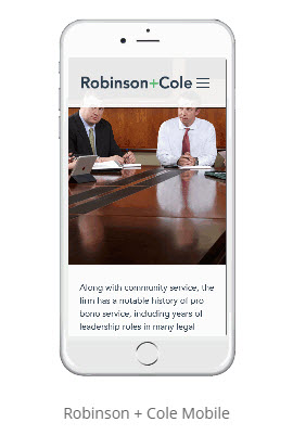
Evolving behaviors fueled by the mobile craze have transformed the way clients interact with law firms digitally. Today, a one dimensional web experience is the surest way to condemn your website to failure. You must engage clients on multiple channels, and mobile is arguably the most important. That means you must deliver compelling web experiences in a world where new device types emerge with alarming regularity. No easy feat. Using CommonSpot, you can transform your website to deliver compelling mobile experiences—no matter which device is being used.
- Present any type of content via any mobile device, including video.
- Create experiences that adapt to various screen sizes using responsive web design.
- Present an all-mobile version of your site or a pared down version with fewer links, navigation, images, etc.
- Allow visitors to choose from available mobile layouts.
- Support new device types as they evolve without reprogramming.
- Use Vanity URLs to create mobile device-specific page aliases.
- Manage your Web content in a central location for all device types.
- Use grid systems to create responsive web designs.
LEGAL FEATURES
- Accolades & Awards
- Analytics
- Attorney Profiles
- Blogs
- Career Opportunities
- Contact Us
- Events Calendar
- Managing Content
- Mobile & Responsive Design
- News & Legal Notices
- Office Locations
- Personalized Content
- Practice Pages
- Related Content
- Search
- Search by Practice Area/Industry
- Search Engine Optimization
- Secure Client Login
- Social Media
- Video & Multimedia